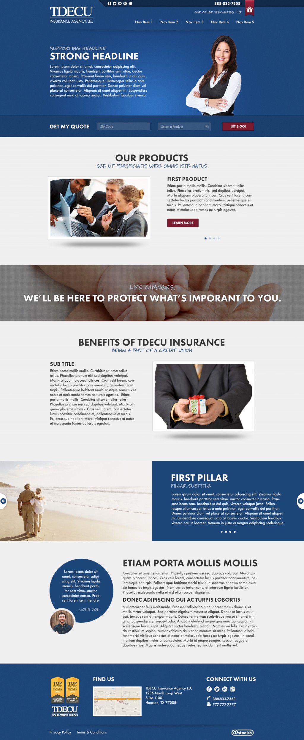
TDECU Website
TDECU is an insurance agency from Texas that is part of a credit union. I was tasked with redesigning and building their new website while working at Astonish. The company provided me with their brand assets and a strict set of guidelines to follow. This particular design was a challenge because the company was in the middle of a rebranding effort when I was starting the design. They had told us up front that they would not be done with their rebranding until after the site had been designed & built, so I didn’t have anything to go off of besides what the company executives had told me about their new direction. To complicate things even more, the company has a few other branches of businesses under their credit union umbrella that also have websites, all of which have similar style and layout. I was asked to create a site that incorporated some of the features from their old brand standards so visitors would know they are still on a TDECU site, but also use some of the ideas and direction for the upcoming rebranding effort.
Design
As stated above, this site had its fair share of design challenges. What really helped me create a successful design was the productive conversations I had with the TDECU team as well as my team at Astonish. The TDECU team was very clear with what they wanted, and provided me with well document brand guidelines as well as numerous examples of other media using their brand standards. The TDECU team also gave me constructive feedback throughout the design process to ensure we were moving in the right direction.
Development
I decided to take a different approach to the development on this site than I have in the past. I read a fantastic article by Ara Abcarians on CSS-tricks about building design “systems” instead of webpages that completely changed my approach to writing css. With this approach I was able to determine style patterns in my design and separate them out into modules. I then determined how the style of these modules would affect its children element styles. For example all of the text inside the dark modules would have to be white, and the text in the light modules would have to be dark. To achieve this in the most flexible way possible with the least amount of css I set all common children elements to inherit the styles of its parent. Doing this resulted in a slimmed down stylesheet as well as an easier way to make global style changes to the site.
