IMDB Redesign
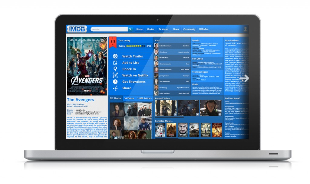
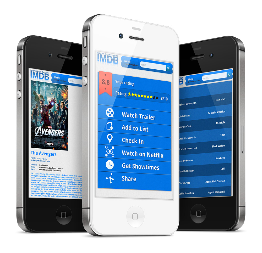
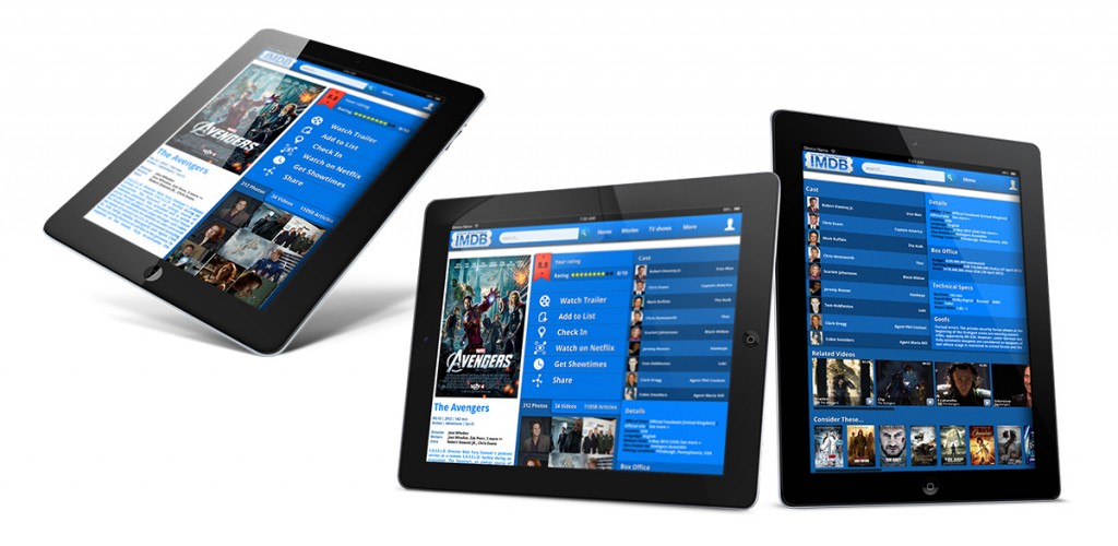
I am a pretty big movie buff, so IMDB can be my lifeblood sometimes. However; I can’t begin to explain how unbelievably frustrating it is to use IMDB’s website. The site holds a massive amount of information and just doesn’t do a great job of organizing all of it. I decided to take a stab at a redesign of the site and created an interface that organizes all of the data in a much better manner. The screen would be divided up into modules that could easily be split off for a responsive design.


