Henry Dunn Redesign
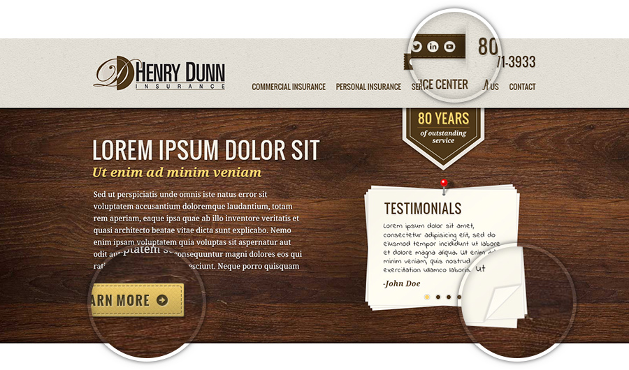
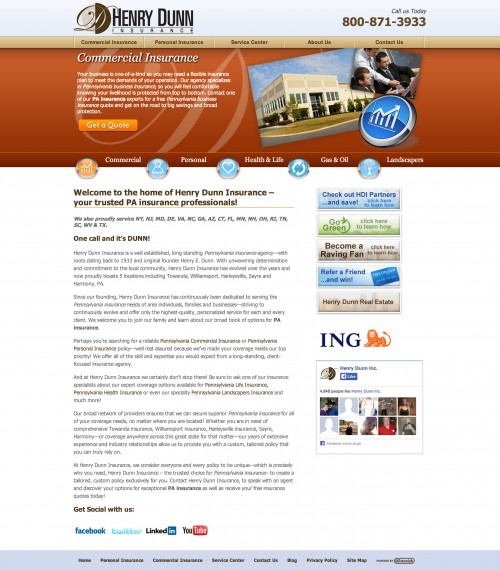
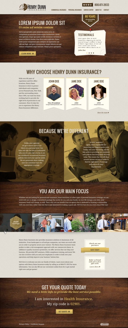
Henry Dunn, one of our enterprise level clients at Astonish, requested a redesign after migrating their website from our old .NET cms to WordPress. After my conversation with the people at Henry Dunn, it was clear that their main focus was not selling insurance. Their main focus was to provide excellent personalized service to their customers. In essence, they were far more concerned with quality than quantity. Because of this, I decided to break the mold of our standard homepage layout model for them. Normally we would have a quote form with a large call to action in a hot spot in the masthead of the page. This is fine for a majority of our clients, as the name of the game is converting visitors into leads. However; since Henry Dunn normally deals with larger clientele, and their business model is much more based on their service, I decided to go with a totally different approach for their design. I essentially crafted their homepage into one large elevator pitch for prospective customers.
Details


