Loiselle Website
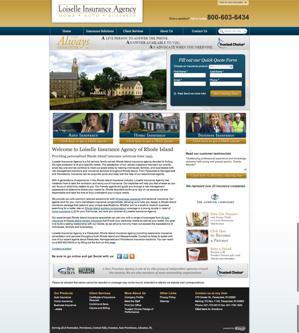
We had recently completed migrating all of our clients at astonish from a .NET based CMS to WordPress when we started the process of giving some of our enterprise level clients custom redesigns. Loiselle Insurance Agency, one of our largest clients, was overdue for a refresh of their website.
Design
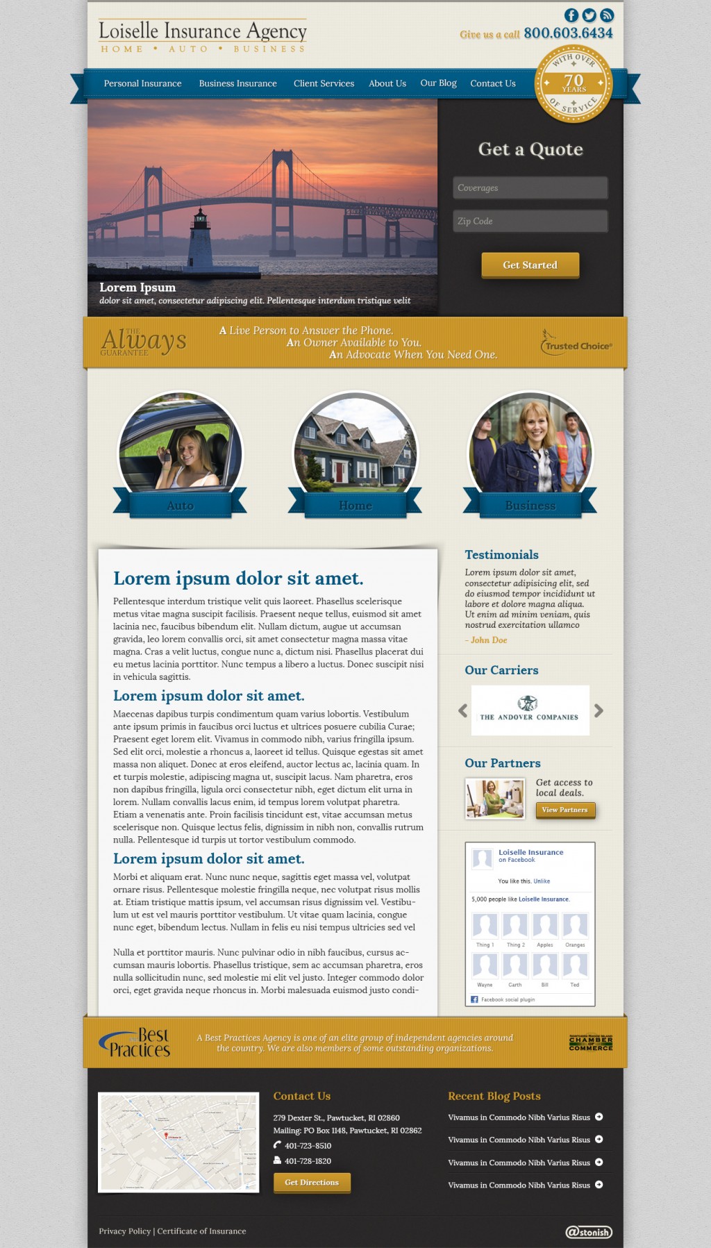
When we were going through the initial planning stages of the redesign, Loiselle had made it clear that they did not want to stray too far from from the layout of their current website. They wanted to get a refresh and bring their site up to date, but didn’t want to “reinvent the wheel”. I decided to personally challenge myself with this design by taking on a skeuomorphic approach to the style of the site. I had recently been designing mostly flat, minimalist sites, and wanted to challenge myself to step out of my comfort zone and do something different.
Development
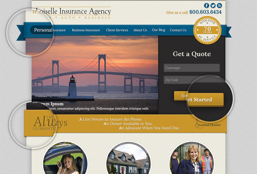
Since I chose the skeuomorphic styling, I ended up with a highly detailed design that I had to figure out how to implement on the web. While designing the site there were several elements that I had no clue how I was going to build, such as the 3d buttons and the navigation ribbon. I ended up building these small but highly detailed elements in codepen where I could focus solely on their styling. You can see from the embedded pens below, the care I took to ensure all of the subtle details from the photoshop mockup were accurately represented on the actual website. This project helped me refine my eye for detail when it came to translating designs to functional mockups.
Pens
See the Pen Elegant Ribbon Menu by Ryan Kanner (@codeProKid) on CodePen.0
See the Pen 3d Buttons by Ryan Kanner (@codeProKid) on CodePen.0
Detail


